Health & Wellness
BRAND STRATEGY, VISUAL IDENTITY, PRINT COLLATERAL, MERCHANDISE DESIGN
OBJECTIVE:
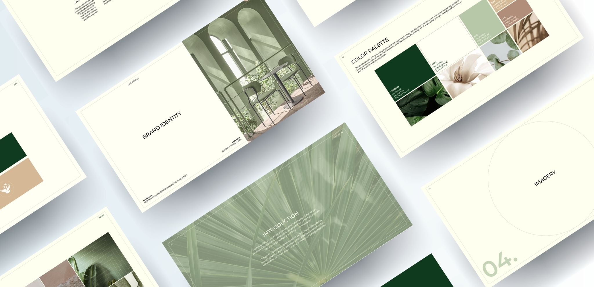
Melissa and Christina, founders in the health and wellness space, were looking for branding for their therapy clinic. They wanted a warm, inviting, and approachable identity that incorporated a variety of green tones to reflect calm and growth. In addition to the brand design, they were also looking for custom merchandise to complement their visual identity.
Brand trust significantly influences an individual's willingness to attend therapy.
Source: Deep Blue
Mood Board
GROUNDED WELLNESS
After a deep-dive call with Melissa and Christina to explore their preferences, I created two brand concepts—this one stood out. With a natural, minimal aesthetic, it emphasizes authenticity and trust. Soft sage and deep greens evoke calm, while warm beige adds balance. The result is an inviting, sophisticated brand that reflects the clinic’s focus on creating a safe and supportive space for healing.
The Process
-
At the heart of this brand is a commitment to normalizing mental health care as a vital part of overall wellness. The strategy centers on creating a warm, welcoming presence that empowers individuals to care for their mental well-being without stigma. With a focus on compassion, reliability, and accessibility, the brand is designed to foster trust and make support feel approachable.
-
The visual identity is rooted in a natural, minimal aesthetic that reflects the clinic’s emphasis on authenticity, trust, and emotional safety. A calming palette of soft sage and deep greens conveys groundedness and tranquility, while warm beige adds a sense of balance and approachability.
-
The print collateral, including brochures and business cards, extends the brand’s warm and trustworthy feel into tangible touchpoints. Designed with the same calming color palette and clean, minimal aesthetic, these materials communicate professionalism while remaining approachable. Each piece is crafted to reinforce the clinic’s commitment to creating a supportive environment.
-
We wanted the merch to feel fun and wearable—extending the brand’s calming, authentic vibe into everyday pieces like sweatshirts and stickers. Each item helps build connection beyond the clinic while keeping the brand approachable and uplifting.
The logo was thoughtfully designed to reflect Health & Wellness’s core values,
with each element of the mark symbolizing a key aspect of the brand’s mission. Together, they form a cohesive emblem that represents care, balance, and well-being.
Every element of the brand—from the logo and color palette to the print materials and merchandise—has been intentionally crafted
to reinforce the clinic’s values together, these pieces create a consistent, supportive brand experience that reflects the heart of Health & Wellness at every touchpoint.


